MyCite Mobile

Abilify MyCite Mobile App

Mobile App | UX Design | UI Design | Design System | New Feature Development | Problem-solving | Iconography | Illustration | Prototyping | Human factors testing
MyCite Mobile is a high-risk, highly regulated digital healthcare product designed to help patients with Major Depressive Disorder and Bipolar Disorder I build sustainable medication and adherence habits. It is especially helpful when patients experience low energy, low motivation, and emotional vulnerability.

This is not a “nice-looking app” project. It’s a behavior-change system developed under strict FDA digital health regulations, Human Factors and usability engineering standards, and strict documentation requirements.

After the redesign, onboarding completion increased from under 50% to 90%, and 90 day retention improved from nearly zero to 30%.
PROBLEM STATEMENT
Patients with mental health conditions, such as MDD and BP1, often disengaged during onboarding due to high cognitive and emotional demands at a time when their capacity was lowest. This resulted in low activation, unstable routines, and poor retention.
DESIGN CHALLENGE
"How might we redesign onboarding and early engagement to feel supportive and non-judgmental, reduce effort while respecting users’ autonomy and emotional state, support easy re-entry after lapses, and still meet Human Factors and FDA requirements for clarity, understanding, and safe use?"
DESIGN SOLUTION
We aim to create a design that feels non-judgmental, low-pressure, and emotionally safe, while also meeting Human Factors and FDA requirements.
Before starting my research, I wanted to understand why users with depression or bipolar disorder abandon apps, and in some cases, they quit before they even begin.
To explore that, I framed my research around 5 key questions:
  • Low-Energy Drop-off: Why do users with low energy disengage from an app so quickly?
  • Onboarding Acceptance: What makes an onboarding experience feel safe and achievable for patients who are already struggling, rather than adding to their burden?
  • Non-Judgmental Design: What design patterns make patients feel judged, guilty, or like they’re “failing”, and what can help them feel supported instead?
  • Trigger Recognition & Coping Access: How can we assist patients in identifying their triggers and accessing the right coping strategy immediately without adding any burden?
  • Retention Drivers: From the user’s perspective, what makes patients trust an app enough to return it regularly, and what breaks that trust?
Competitor analysis
I’m conducting competitor analysis to identify which design patterns and features lead users to abandon mental health apps that are currently available in the market.
Specifically, I want to understand:
  • What barriers in existing apps prevent users from accessing support when they has low energy?
  • Which design patterns unintentionally shame or judge users?
  • How do existing apps manage or fail trigger identification and access to coping strategies?
  • How do existing apps handles patient engagement, and how they build trust with users?
I’m analyzing 3 existing apps listed below. Because they share some of the same goals as our app.
MindDoc
Clinically-based
mental health app
Headspace
Meditation app for
emotional support
Medisafe
Medication
Tracking app
PDF - RESEARCH
Click to see detailed research.
Key Takeaways
  • All three apps use quick-entry interactions to lower the entry barrier by guiding users into small, repeatable actions.
  • Each app is built around a single “primary job” , so users immediately know what to do first and don’t feel confused. And this creates retention.
    MindDoc -Tracking insight
    Headspace -Calming meditation content
    Medisafe -Meditation adherence
  • Retention is driven through routines for all three apps, but they implement it differently
    MindDoc -Daily Check-in routine
    Headspace -Streak-based habit routine
    Medisafe -Dose-confirmation routine
  • Reminders are a shared engagement tool among all three apps, but if these reminders create pressure or feelings of guilt, they may lead users to quit the app.
  • Streaks, missed-day messagings, and completion metrics can unintentionally create guilt and a sense of failure, especially when users can’t show up consistently.
Therefore, MyCite Mobile should offer a fast, intuitive entry point and clearly highlights the primary task, so users can instantly understand the first step. We also need a reminder experience for the engagement routine, but it should be caring and encouraging in both language and visuals, avoiding any sense of pressure.
Interviews & Mapping
To better understand how patients, clinicians, and family members think about when support matters most, I conducted user interviews for these 3 user groups to identify the true trigger points just before disengagement and to explore what internal factors lead someone to decide not to open the app.
User Groups
1 on 1 Interview
Duration: 45-60 minutes per participant
Gender
Male: 50%
Female: 50%
3 User Group
Total participant: N=10
Age Distribution (All Participant)
18-25: 2/10
18-25: 2/10
35-30: 2/10
50-65: 3/10
Affinity mapping
I created an affinity map to brainstorming and analysis all the findings based on our user interview responses.
Every cluster pointed to the same feeling:Users felt judged. Users felt ashamed.
Where we need to Improve:
1
Low-Energy Friction
Too much effort at the worst moment.
2
Unsafe Onboarding
Sensitive questions before trust is built
3
Shame & Guilt Mechanics
Streaks and scores that punish instead of support
4
Tracking & Data Reliability Issues
No space for "I don't know" and multiple moods
5
Context-aware Compassion
Users need flexibility, not pressure
6
Crisis Support
Critical moments the app couldn't recognize
Results
After organizing all the interview datas into an affinity mapping, clear patterns emerged that directly affected our design decisions. This research process revealed not only what frustrates users, but also why apps fail at the critical moments people need them most.
Key Findings:
  • Apps don’t work when people are actually need help, there’s too many steps for them to do
  • Judgmental tracking metrics make people feel worse at the exact moment they ask for help
  • Heavy text readings, too many steps and options makes people want to abandon the apps
  • Onboarding questions and gamification harm users when they’re most vulnerable
  • There’s too much emotions for BP1 patients, they don’t know which mood to log in
This research revelaed something crucial:
App abandonment isn't motivation problem, it's a design accessibility problem.
Persona
To better guide our design and make informed decision, I created two personas that represent our primaryuser groups. These personas capturing their goals, behaviors, needs, pain points and motivation to keepthe product experience user-centered throughout the project.
User mental state map
Because our users are emotionally sensitive, I created a User Mental State Map to better understand their thoughts and feelings across the entire journey. This map captures key actions, emotions, and pain points at each stage, helping us identify real struggles and emotional triggers, and enabling design decisions that are more empathetic, frictionless, and grounded in real behavior
Based on our research and Personas, we aim to create a design that feels non-judgmental, low-pressure, and emotionally safe, while also meeting Human Factors and FDA requirements.
Because our users are often low on energy and high sensitive to pressure, we prioritized simple steps, supportive language, and gentle patterns. This led to three key product features:
1
Safe Onboarding
& Re-entry
Small steps,
Pause / resume
Gentle reconnect reminder
2
Low-effort
Daily Habit
One-tap Check-in:
Mood, contributors,
sleep, energy
3
Calm Insight
Optional Support
Soft Trends
Optional Coping
User flow diagram
These three pillars shaped the end-to-end experience. The user flow below shows how we translated them into a full patient journey.
With the end-to-end journey defined, we then broke the experience into three core flows and designed each one around the same principles: reduce cognitive load, protect emotional safety, and support re-entry. Below is a closer look at how each flow works and the specific design decisions behind it.
FLOW 1
ONBOARDING EXPERIENCE
Our Goal: Designing a trust-first, low-cognitive load onboarding experience for users with Major Depressive Disorder and Bipolar Disorder.
research insight
Understanding the User
From the research we conducted earlier, we get a better understanding of the psychological state and needs of users with mental disorders during onboarding
Limited Mental Energy
Users face challenges with everyday tasks and often find it hard to concentrate. Each decision, tap, or form field drains already limited energy.
Highly Sensitive
Users are sensitive to tone, wording, and perceived judgment. They seek authentic understanding,not toxic positivity or clinical detachment.
Deep Trust Issues
Users worry about being judged, misunderstood, or having their data misused. Trust is built through transparency, not presumed.
Emotional Overwhelm
Users are dealing with intense emotions or numbness, they cannot manage extra stress from confusing interfaces or onboarding demands.
Design Principles
Our design must address users' challenges and deliver solutions that meet their specific needs.
Safety First
Build trust before requesting data
Progressive Disclosure
Reveal information one piece at a time
Easy Exit
Always offer “ do it later”
option.
Accessible Support
Always provide “need help” phone number
Supportive Tone
Warm, honest, understanding tone
Clean Design
Calm colors, minimal
visual noise.
onboarding journey
I structured our onboarding journey into six steps to ensure users have a successful onboarding experience.
Step 1
Emotional Connection
Using calming visuals and welcoming language to create emotional safety before asking for any commitment.
Step 2
Supportive Tone
Through empathetic opening, we lower users’ guard and create a positive first impression.
Visual Design
Soft gradient background, calm graphics, avoiding overly bright colors
Step 3
Transparent Data Sharing
Addressing privacy concerns upfront with clear, plain language about what data is shared and why.
Step 2
Minimal Setup
Focus on essential task only
User Control
“How can I change what I am sharing” provides control to users
Step 5
Guided Experience
Step-by-Step guidance so users never feel lost
or confused.
Step 6
User Control
Give users control, allowing them to decide whether to stay or leave on their own terms. Users can always come back to where they left.
Showing Steps
Show progress to users, so they know where they landed
Video-First Learning
Reducing cognitive load by showing rather than telling through video instructions.
Focus one task per step
Instead of giving tutorial at once,we focus on one step a time, give users room to breath
Onboarding Flow Overview
A complete, low-friction journey designed for emotional well-being.
FLOW2
DAILY CHECK-IN
Our Goal: Support an low-effort daily habit for low motivation users, not clinical and not obligatory.
research insight
Understanding the User
From the research we conducted earlier, we get a better understanding of the psychological state and needs of users with mental disorders during check-in
Emotional Uncertainty
Their moods can shift dramatically hour to hour. Sometimes they can’t identify what they’re feeling.
Zero Energy
Getting out of bed might consumed all their available energy. Every tap, swipe, and decision feels like climbing a mountain.
Self-Criticism
Users worry about being judged and misunderstood, even from an app.
Routine Fragility
“I missed 3 days, might as well give up” Routines collapse during episodes, they might just give up if there’s too many missed days.
User Painpoints & Design Solutions
ZERO ENERGY
---Zero typing required, a few taps to complete
CAN'T DESCRIBE EMOTIONS
---Visual emoji selection
Self-judgment
---Neutral language, no streaks
Routine breaks easily
---No gamification, warm welcome back message
Easily to quit
---Auto-save every step so users can exit anytime
Break down into 4 emotional steps
How we turn a heavy task into 30 seconds of lightness
Feel
Notice
Sense
Finish
Step 1: Feel
Allowing multiple check-ins meets specific needs and helps reduce anxiety.
User Psychology:
Emotional Uncentainty
70% can't identify mood
No energy for complex decisions
Step 2: Notice
User Psychology:
Need Understanding
No Explanation
Fear Interrogation
Already Saved
This step is optional, mood is recorded, we give users control if they don’t feel like record contributors
Quick Tap
No justification
Step 3: Sense
User Psychology:
Connection between body and mind
Shame about sleep patterns
Non-judmental Language
“I woke up feeling..” instead of “Rate your sleep”
No numerical labels
Avoids shame about “bad” numbers
Option to skip
Give users control to skip the step
Sliders, not numbers
Users don’t need input exact number
Step 4: Finish
User Psychology:
Fear of judgment
Need reassurance
No evaluation
No streaks or score
Avoid scoring, evolutions
Stay Neutral
Users receive a neural confirmation once this flow is complete.
Option to skip
Give users control to skip the step
Daily Check-in Flow Overview
A complete, low-friction journey designed for emotional well-being.
FLOW 3
Insights & Trend
Our Goal: Make patient curious about their own data, making collection for clinicians a natural outcome of their own interest.
research insight
Understanding the User
From the research we conducted earlier, we get a better understanding of the emotional state of highly sensitive users with mental disorders when they encounter their own patterns.
Fear of Confirmation
Users worry that their data may confirm a lack of progress, and are sensitive to “bad” scores or judgmental language like “better” or “worse.”
Numeric Scoring Triggers
Percentages, scores, and metrics feel ike report cards. Numbers amplify self-criticism
Pattern Anxiety
Fear of what the data might reveal. Users were anxious about seeing their struggles quantified.
Routine FragilityDesire for Acknowledgment
Users want validation for effort, not just outcomes. The journey matters more than destination.
User Painpoints & Design Solutions
Translating Needs into Hard Rules
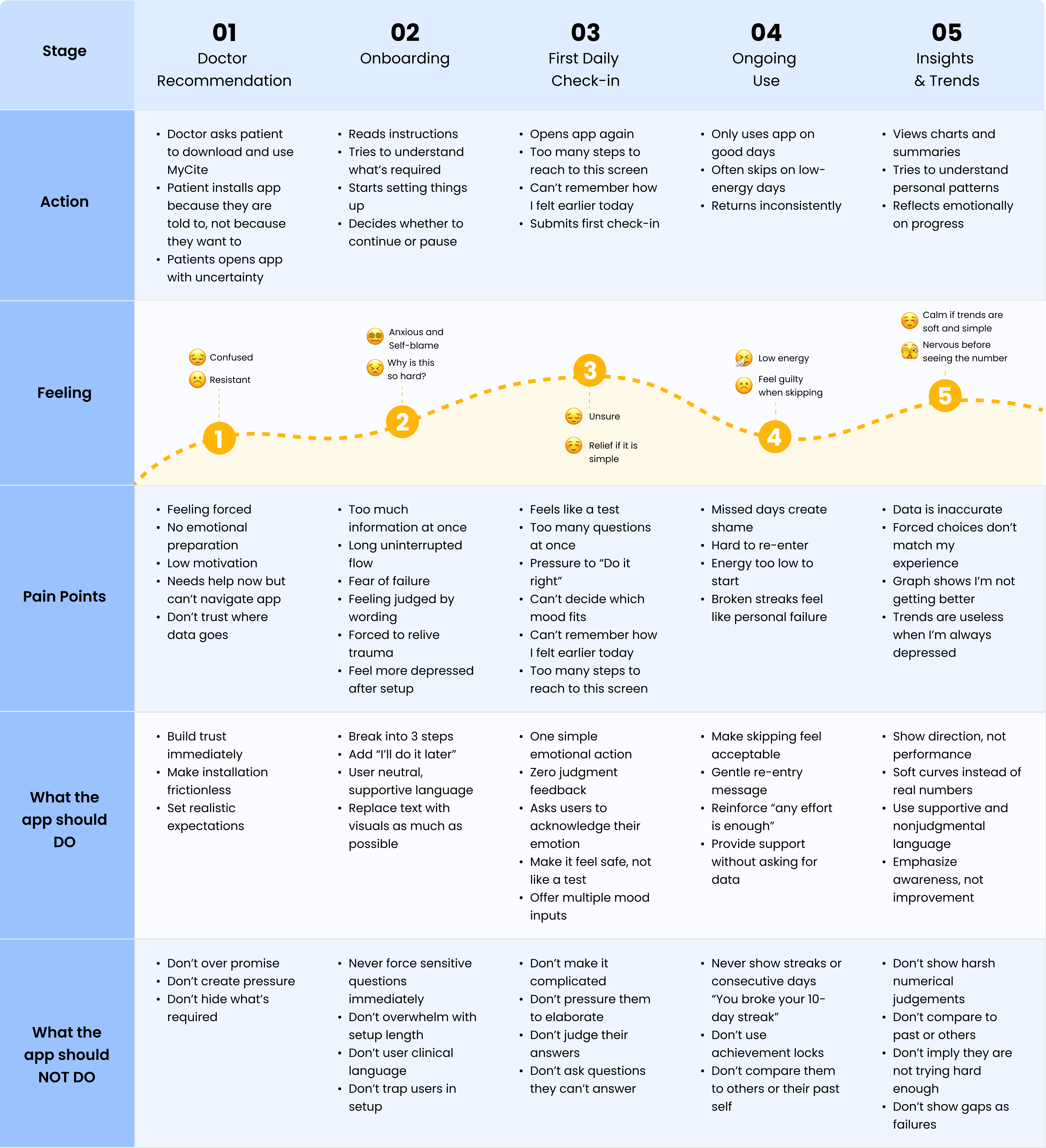
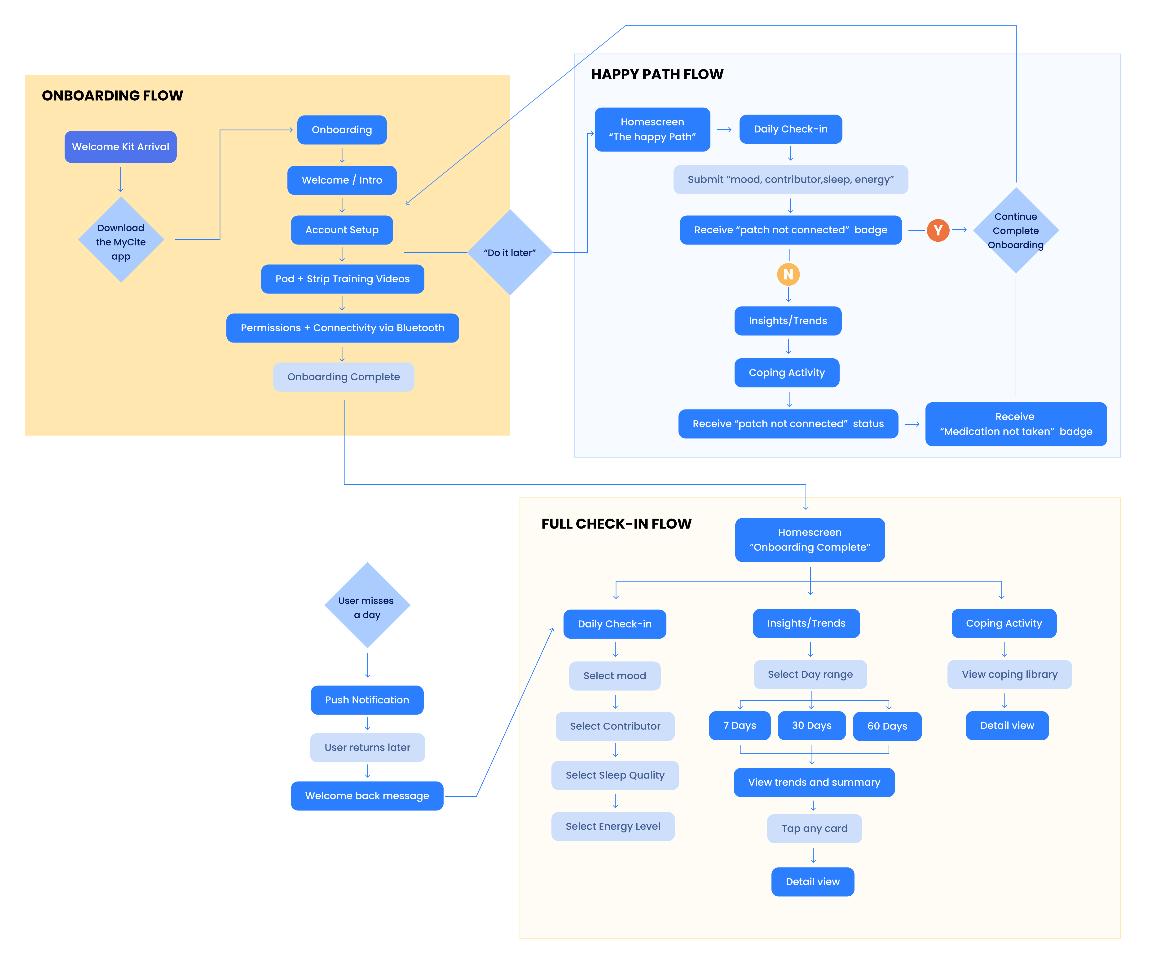
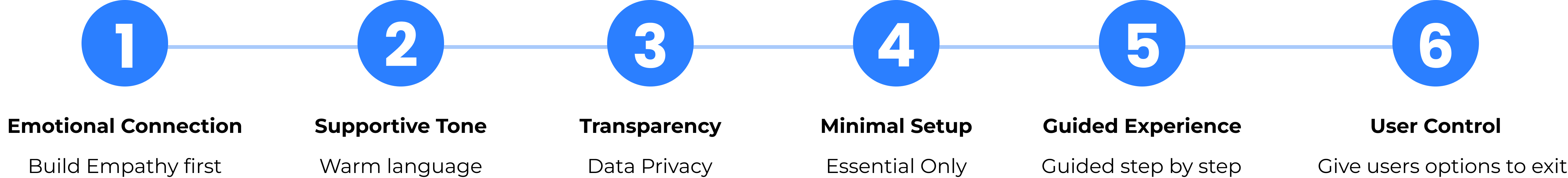
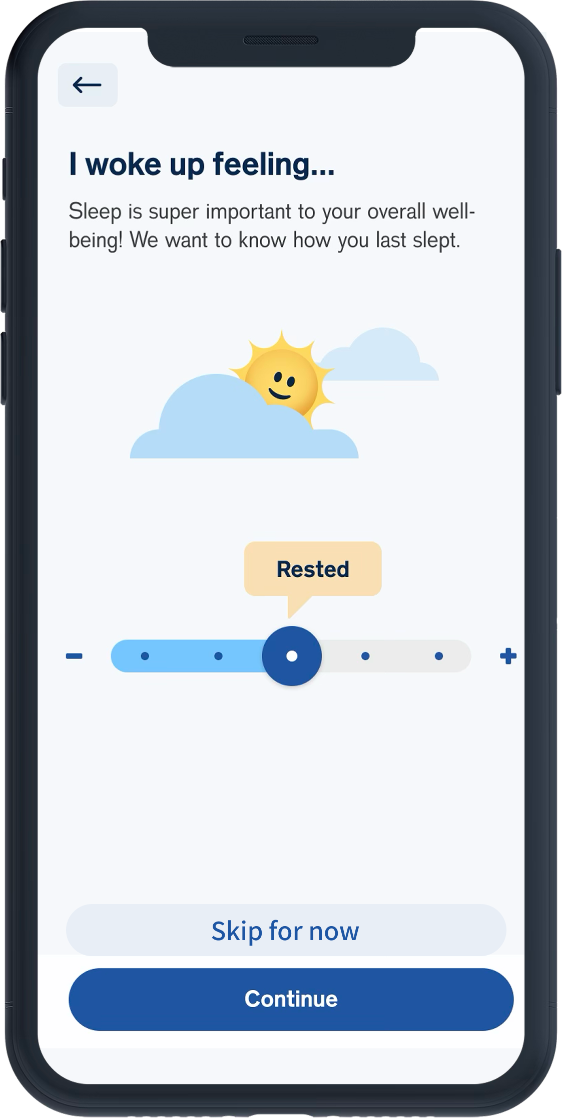
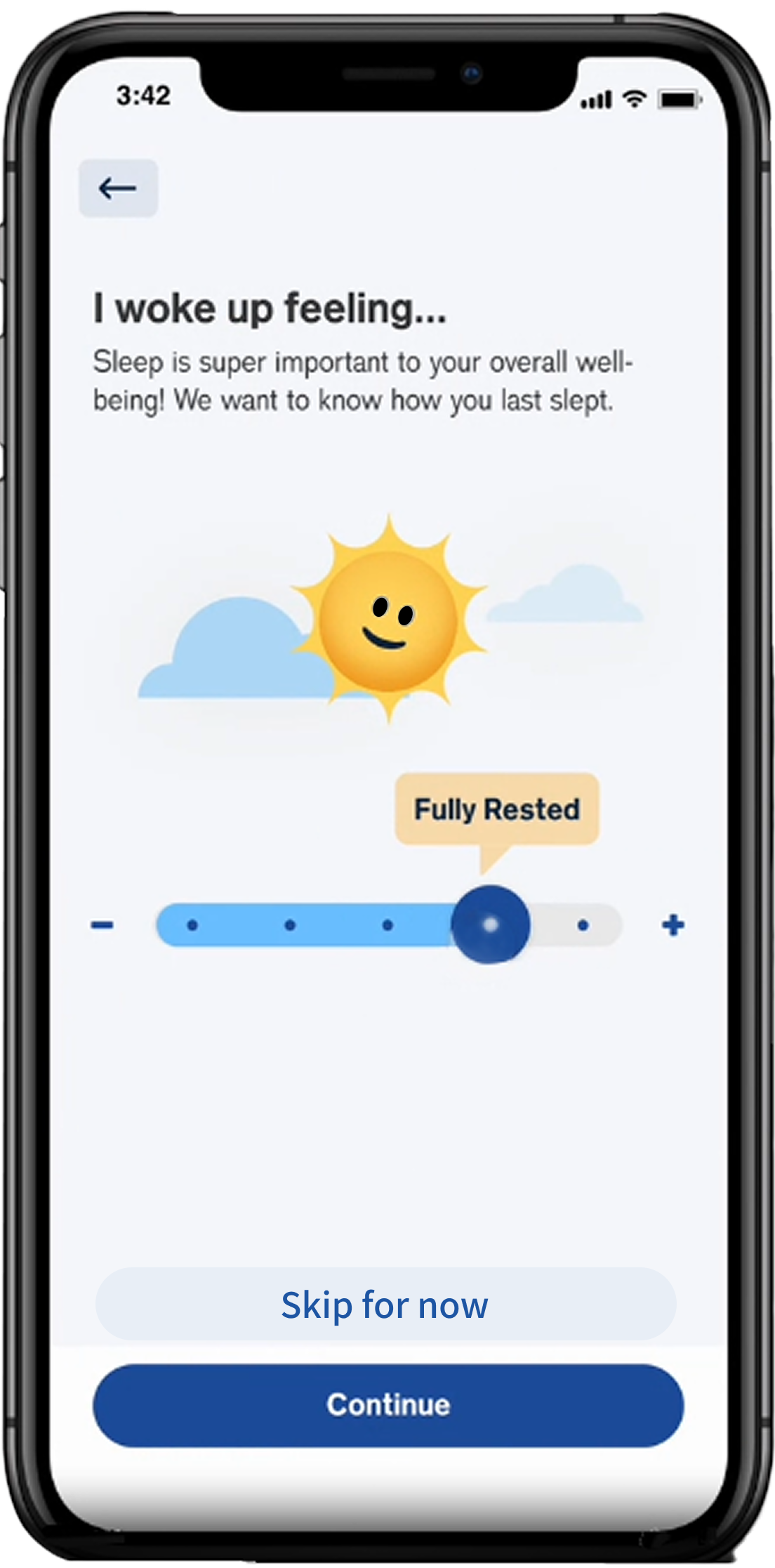
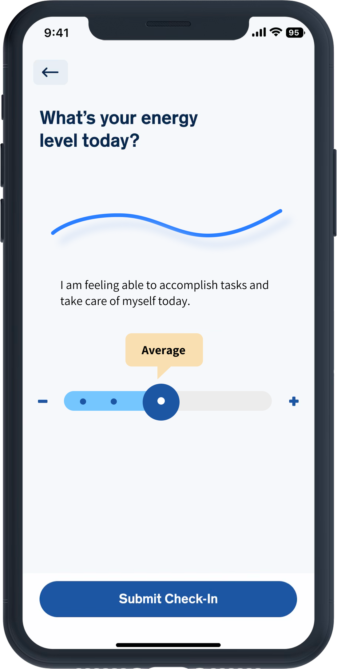
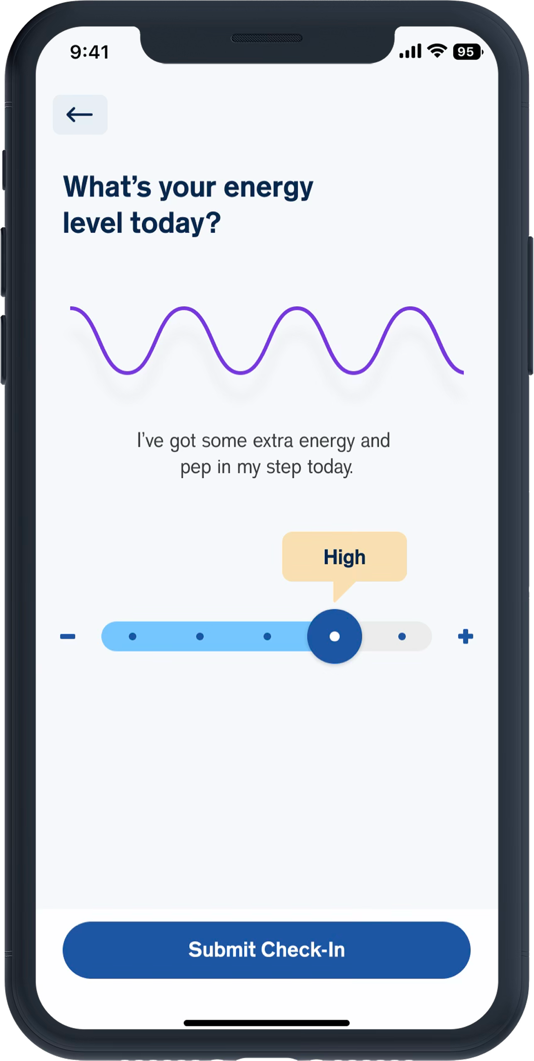
Fear of numeric “proof” of failure
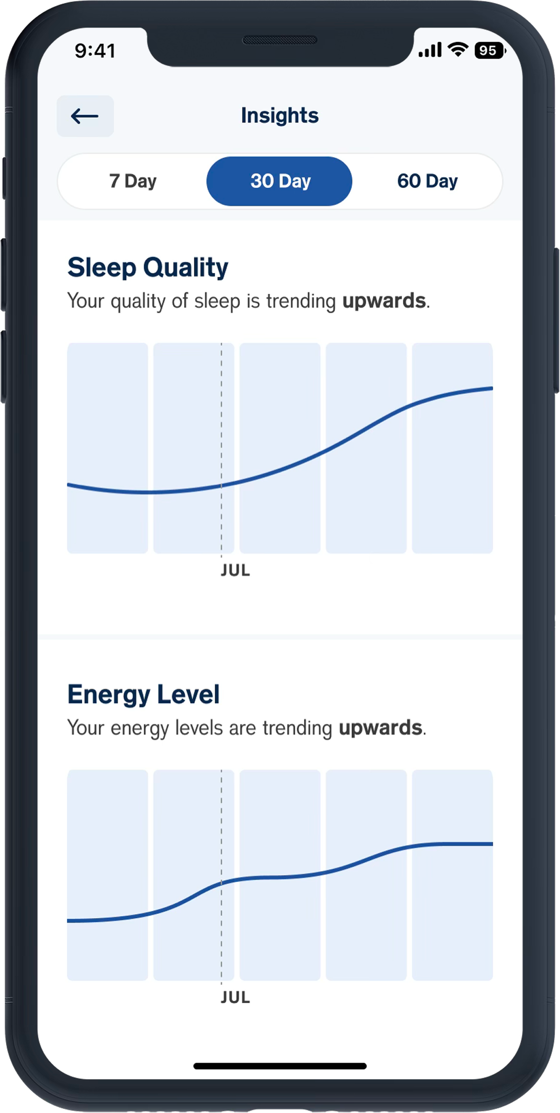
---No percentages, scores, only visual trends
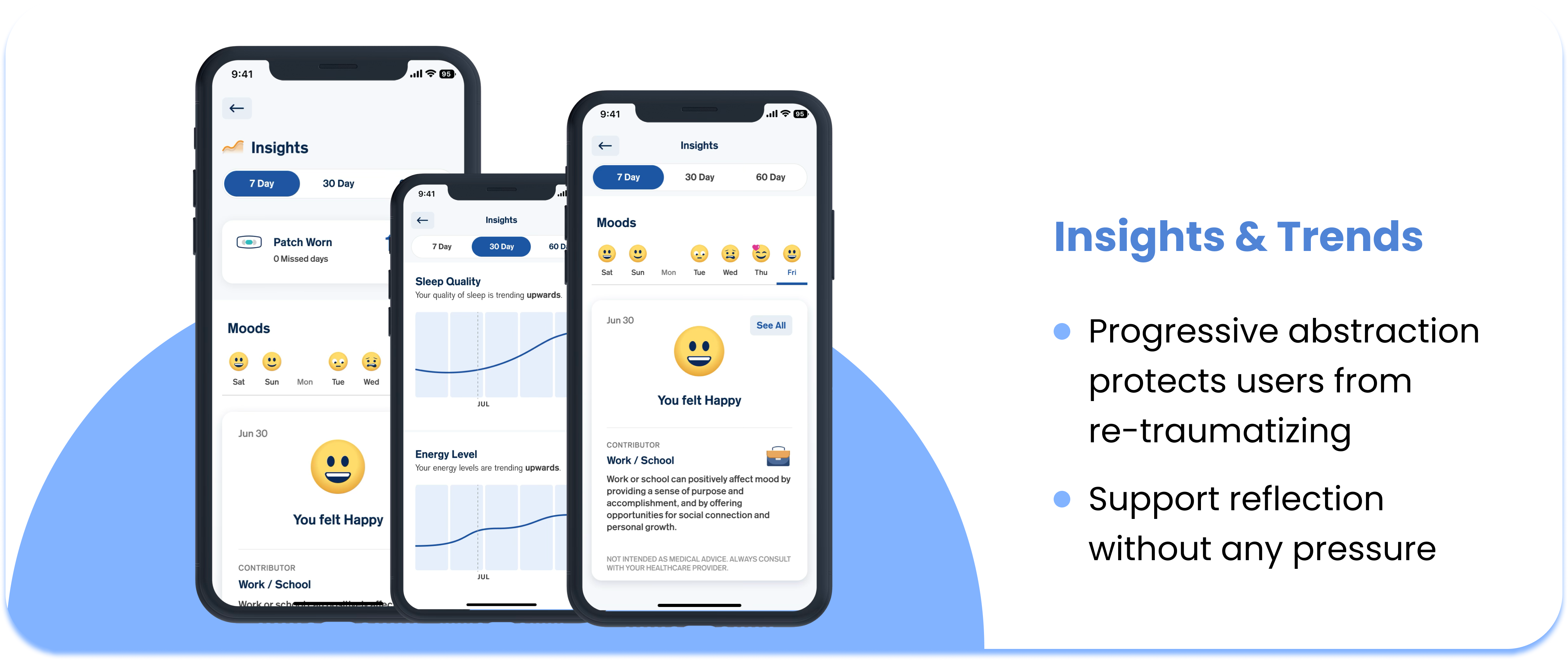
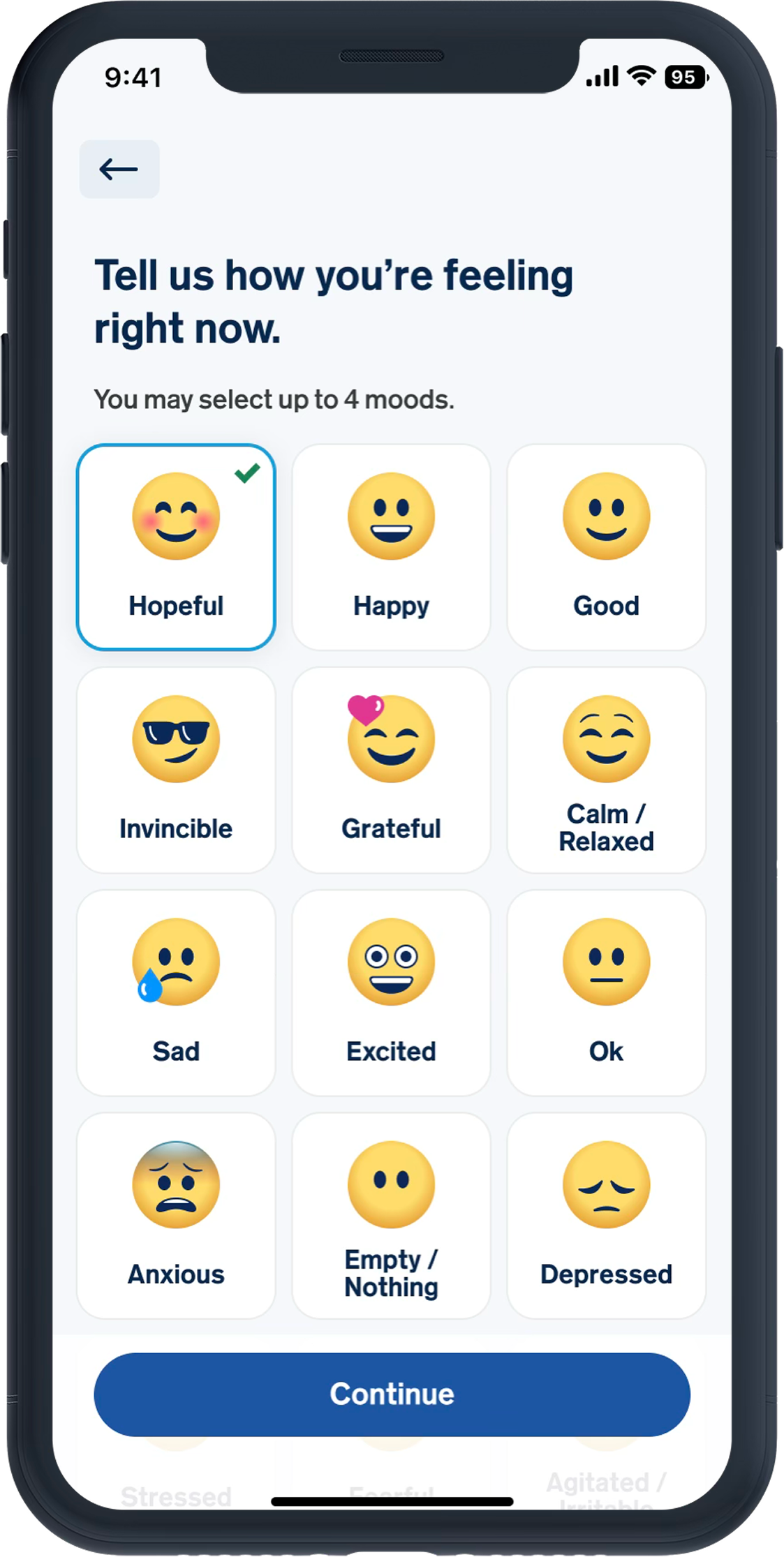
Pattern anxiety
---Progressive abstraction, make data less specific
Clinical-looking charts trigger bad memories
---Soft colors and gentle shapes, avoid clinical design
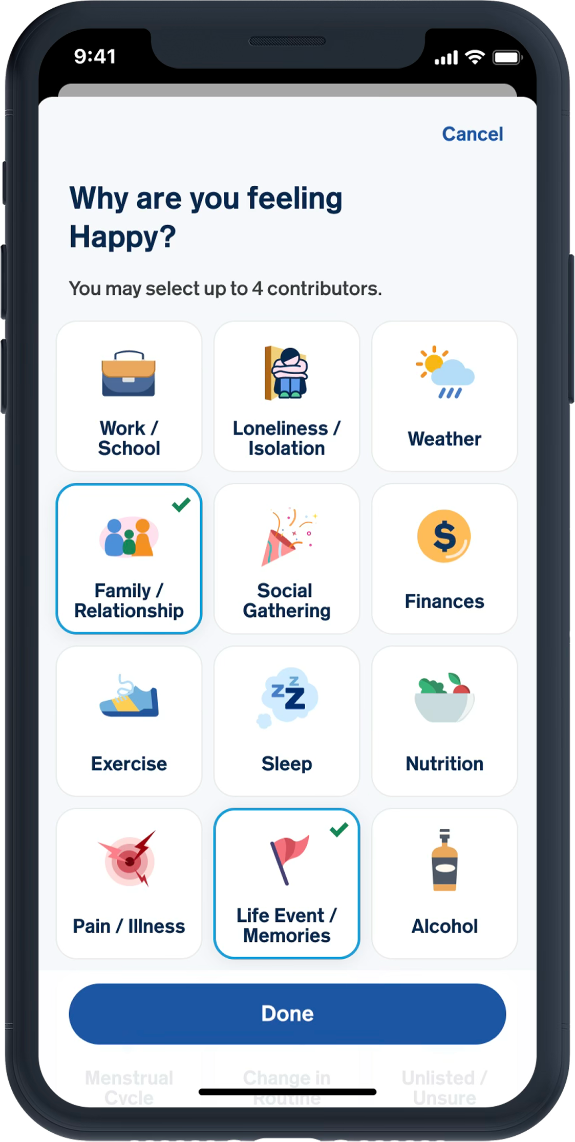
Comparison to “normal” triggers shame
---No baselines, no “most people feel X” comparisons
Need validation for effort
---Built-in affirmations design
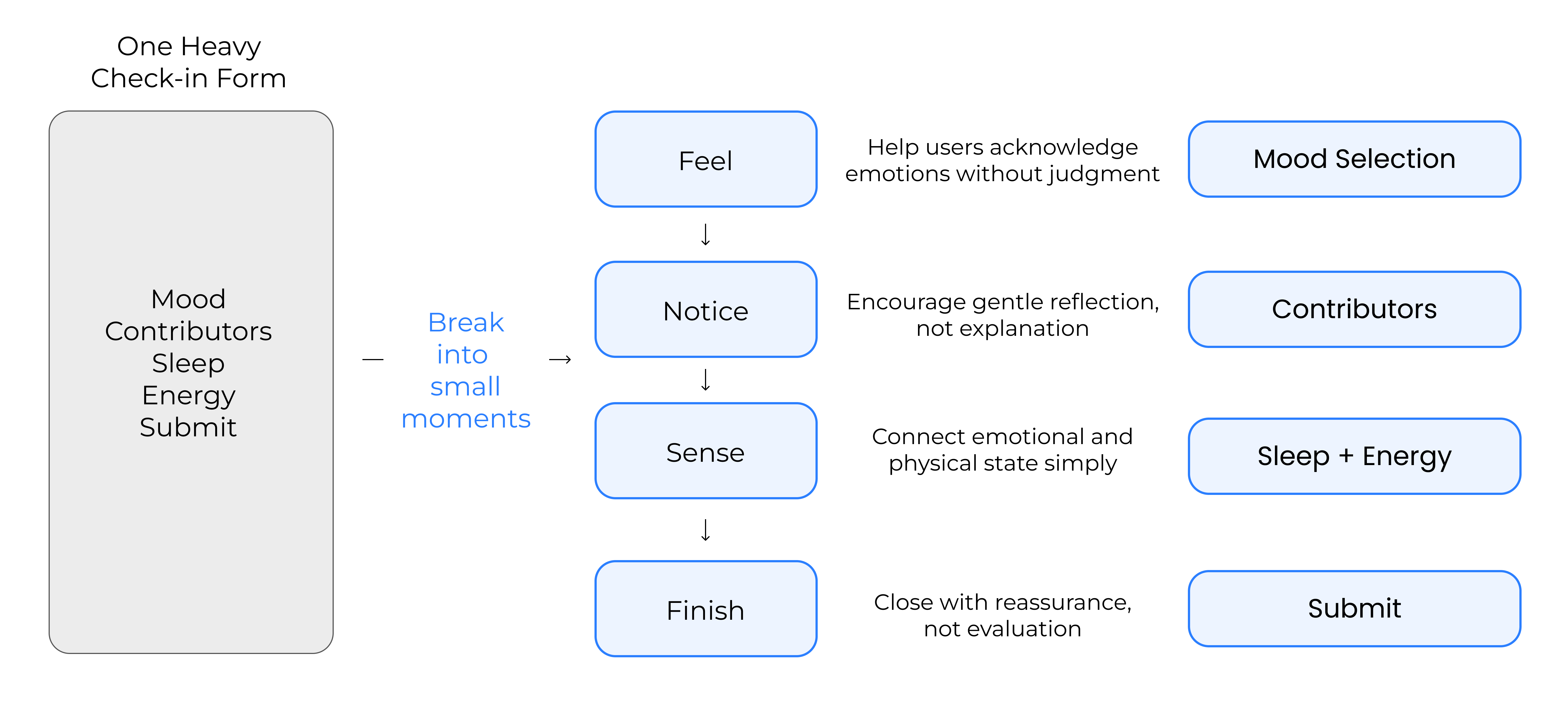
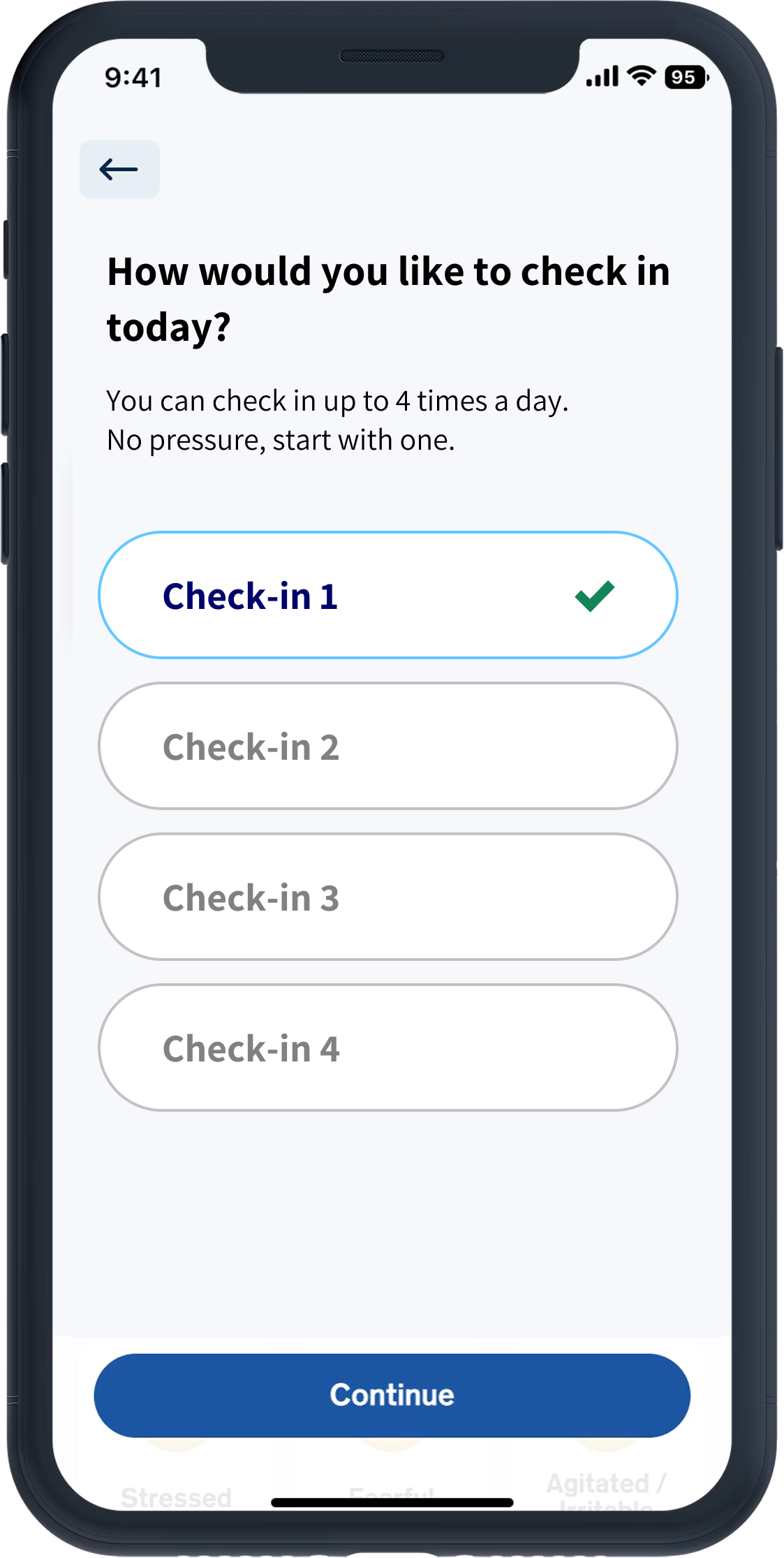
Overwhelm from too much detail
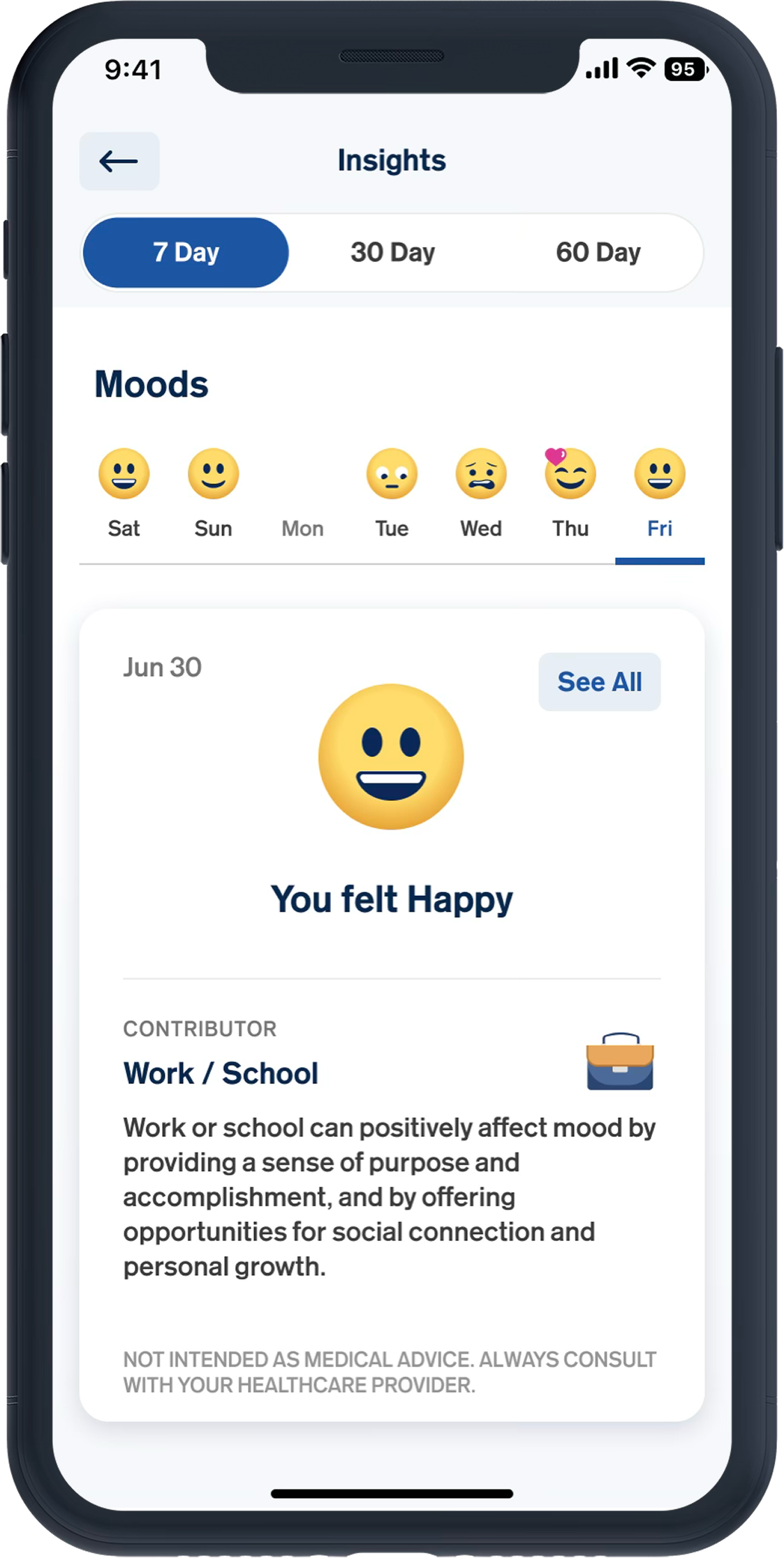
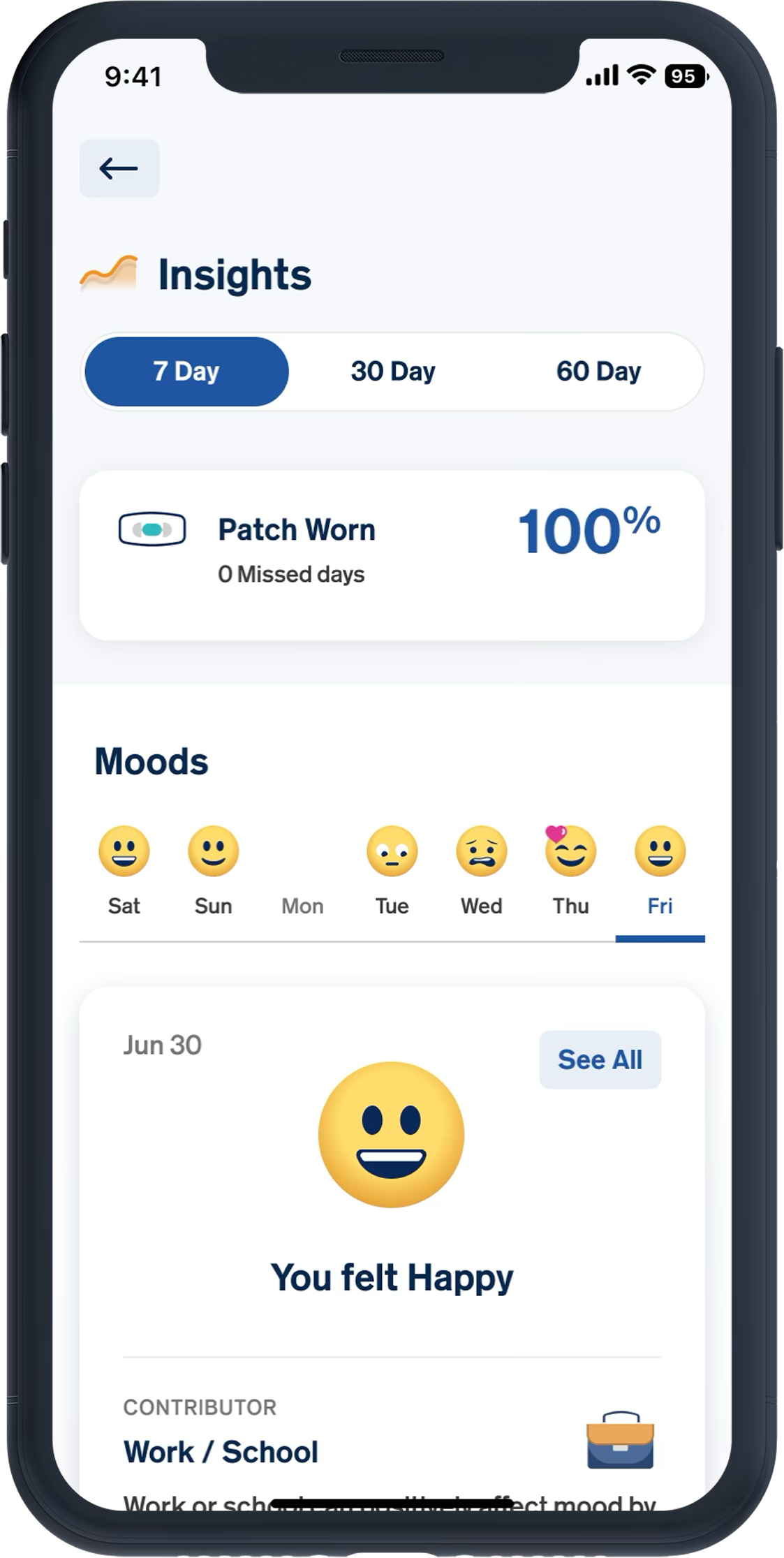
---Divided data into 7/30/60-day views, not showing all at once
The Progressive Abstration Strategy
As time passes, specificity decreases. This creates psychological distance for users to track their datas.
To address this,  we divide data into ranges that balance detail with psychological distance.
7-Day
DETAIL VIEW
Close-up insights into recent moods and activities
30-Days & 60-Days
GENERAL SUMMARIES
Abstracted trends to provide psychological distance
7-Days
Detailed View for Mood and Contributor
The 7-Day view displays users' exact logged data in a simple, non-judgmental format.
User Psychology:
Detail recent memories
Want to revisit specifics
User Control
Users can switch between  7 / 30 / 60 days, allowing them to decide how much information they feel comfortable viewing.
30-Days
60-Days
General Summaries
The 30-Days and 60-Days view displays users' logged data in a gentle, abstract views.
User Psychology:
Avoid re-traumatizing
Need psychological distance
No Numeric Scoring and Comparison
Visual representation only, no scores, percentages, or comparisons.
Wavey visual trends
Gentle, abstract waves without axes or data points. Shows flow and rhythm, not 'good' or 'bad' days.
Insights & Trends Flow Overview
A complete, low-friction journey designed for emotional well-being.
Project Impact
onboarding completion rate
90%
Increased from <50% post-redesign
60-Day Retention rate
30%
Improved from nearly zero
Empathy is the Key
Designing for mental health isn't about features; it's about matching the user's emotional wavelength at their lowest points.
UX Must Adapt to Energy
Interface complexity should scale inversely with user energy. The 'Worst Day' requirement is the ultimate stress test.